
Flow builder
Author screens, branches, motion, paywalls, and collaboration on the visual canvas.
Purpose
Use the flow editor to design a versioned onboarding storyboard: ordered screens, decision branches, modal steps, motion, localized copy, Integration Nodes (Stripe Payment Links, RevenueCat / Superwall paywalls), and External Surface Nodes (host UI) — without shipping a new app build for every copy tweak.
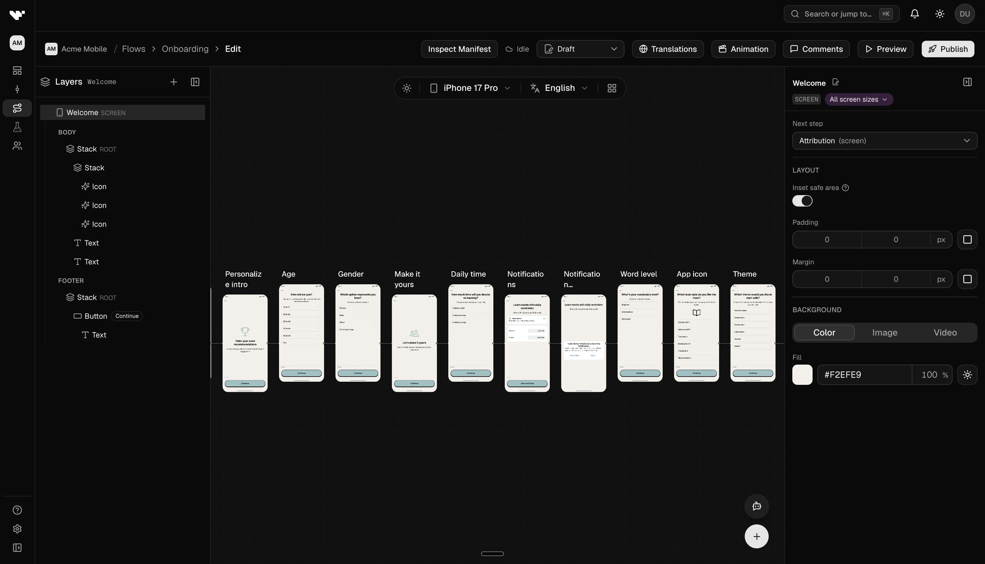
Open the flow editor
- Go to your app’s Flows page.
- Click Edit on the flow you want to change.
Canvas and graph
Use the canvas to arrange screen nodes, decision nodes, Integration Nodes, and External Surface Nodes. Connect edges for linear paths, branches, and Fallback routes (required for every integration and external surface).
Select a node to open its settings in the side drawer. Use the add menu on the canvas to insert new screens, decisions, or integration steps.
Select multiple canvas nodes (⌘/Ctrl-click) to copy or delete them from the selection pill on the canvas.
Layers panel
Select a screen to edit its content in the Layers panel (or select the screen node itself for shell chrome):
Layout sizing
Each layer has width and height controls in the inspector. Modes match flexbox / Figma semantics on both axes:
| Mode | Behavior |
|---|---|
| Hug | Sizes to content (auto). |
| Fill | Occupies the parent on that axis (full for width, fill for height). |
| Fixed | Pixel size you enter. |
| Fraction | Half, third, two thirds, quarter, or three quarters of the parent on that axis. |
Fill chains: A child set to Fill only grows when its parent is also Fill (or a fraction) on that axis. If a region should expand, set Fill on every ancestor up to the body stack. The builder shows a warning on the width/height control when a Fill chain is broken, and offers an inline Set ancestors to Fill action that repairs the chain for you.
Body stack: The screen body region root stack always fills the available body area — you do not need to set Fill on it for basic full-screen layouts.
Hug wins on the cross axis: Hug (auto) is never upgraded to Fill just because the parent stack uses stretch alignment.
Min / max size: Optional Min width, Max width, Min height, and Max height clamps (pixels) sit under Size in the inspector. They constrain the layer box without changing Fill / Hug / Fixed mode.
Absolute position: When position is Absolute, placement uses pixel insets (top / right / bottom / left) plus optional width and height. There are no Figma-style constraint pins (for example pinning both left and right to stretch).
Screen chrome
With the screen selected (not a layer), use Appearance and layout chrome:
- Inset safe area — keeps header, body, and footer clear of the notch, status bar, and home indicator. Uses device safe-area insets at runtime; the canvas preview follows the selected device. Manual padding adds on top.
- Screen background — Color, Image, or Video on the Background row. Image and video support fit, opacity, and an optional scrim overlay. Video adds loop, auto-play, trigger button, and audio (same playback model as video layers, including Play media button targets for screen backgrounds).
Layer families
- Content — Text, media, buttons, layout stacks, and other building blocks.
- Input — Text fields, scale, wheel picker, date/time, number stepper, phone, address, and choice groups (see Form inputs below).
- Loader — Full-screen or inline loading treatments that respect the motion timeline.
- Hyperlink — Opens external URLs; the native SDK tracks opens for analytics.
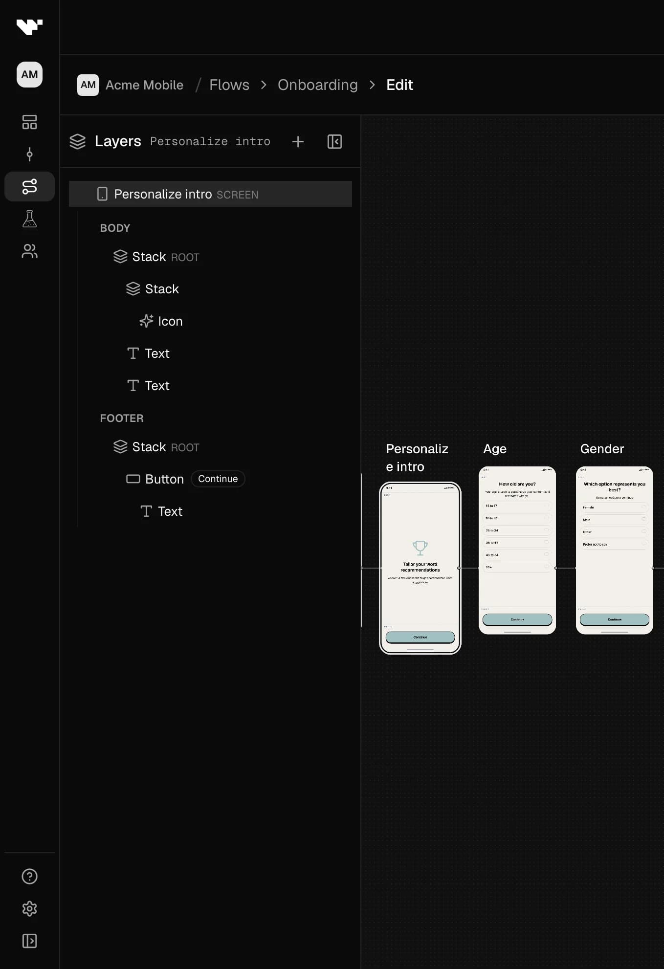
Multi-select and bulk edit
In the Layers tree:
- ⌘/Ctrl-click adds or removes a layer from the selection.
- Shift-click selects a contiguous range from the current anchor.
With two or more layers selected, the inspector switches to a multi-edit panel:
- Shared appearance: background, radius, opacity, padding, and margin (applied to every selected layer that supports
style). - Text layers: shared default-locale copy plus typography (color, size, weight, align, font family).
- Choice option stacks that support Default / Selected styles: use the inspector tabs to edit default vs selected appearance across the selection.
- Fields that differ across the selection show as mixed. Setting a value writes it to every selected layer.
- Delete removes the entire selection.
Find and replace copy
Open Find and replace copy from the Layers panel toolbar (search icon).
- Scope — entire flow, current screen, or currently selected layers.
- Finds and replaces authored copy (
LocalizedText), with an option to include translations. - Optional Match case.
- Workflow: enter text → Find to highlight matches on the canvas → step through hits → Replace or Replace all with confirmation.
- Does not rewrite IDs, field keys, or non-copy structural fields.
Form inputs
From the Input group in the add-component catalog you can collect answers beyond text, scale, wheel picker, and choices:
| Layer | What it collects |
|---|---|
| Date / time | Mode: date, time, or datetime. Uses native device pickers on iOS and Android. Optional min/max and default. Mark safe or sensitive like a text field. |
| Number stepper | Numeric value with +/- controls, optional unit label, and min / max / step / default. Structural children (value and increment / decrement buttons) can be styled separately, similar to email/password auth compounds. |
| Phone | Country code plus national number. Set a default country (ISO alpha-2). Mark safe or sensitive. |
| Address | Postal address fields; toggle line 2 / region and which fields are required. Optional default country. |
These inputs need an on-screen Continue button (same rule as text fields, scale, wheel picker, and multiple choice). Keep one question per active path — without a Conditional that means one input per screen; sibling Conditional branches may each ask their own.
Text field options
On a text field layer you can also set:
- Helper text — shown under the field when there is no validation error (format hints, examples).
- Validation mode — On blur (default), On submit, or Live (as the person types).
- Autocapitalize override and Return key label (done, next, go, send, search).
- Required plus optional min/max length.
- Input type (plain, email, phone, URL, number, multiline) drives the soft keyboard and basic pattern checks.
Email / password in the builder
Email/password auth blocks support password rules in the inspector: minimum length (defaults to 8 when unset), optional maximum length, and optional requirements for uppercase, lowercase, digit, and special characters. Rules run as client-side validation before your host auth handler, and help drive iOS Automatic Strong Password hints. See Authentication layers for host wiring.
Motion and timeline
Open Animations from the top bar to tune enter/exit motion and use the timeline for timing. Preview motion in context before you publish.
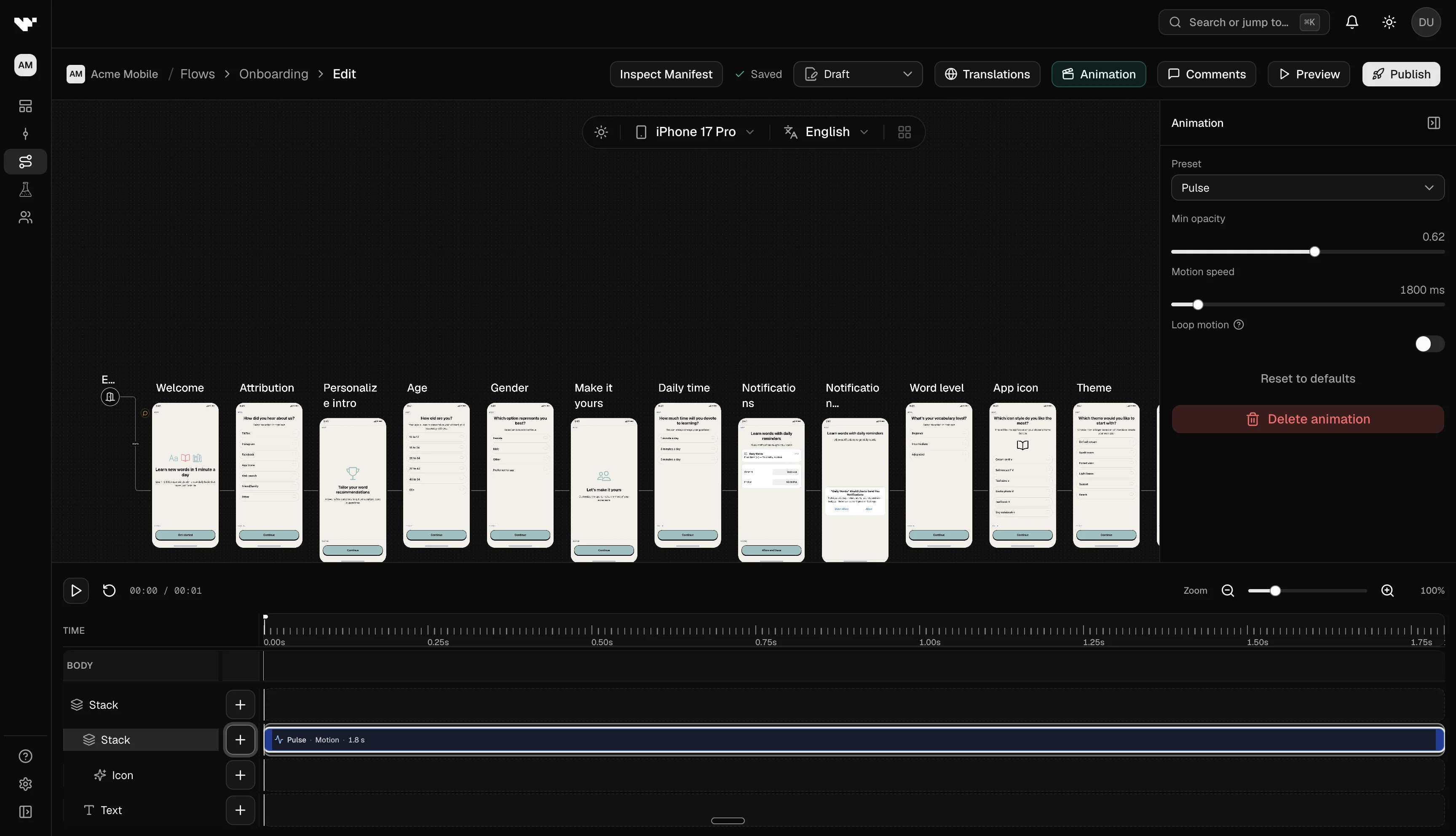
Lottie and video layers use inspector settings (Auto-play on mount, optional trigger button, On complete when play-once). They are not scrubbed on the animation timeline like loaders; opacity and resting-motion clips still appear on the timeline as usual.
Comments
Add comments for reviewers. Threads anchor to canvas nodes (including decisions, Integration Nodes, and External Surface Nodes). Open the comments browser from the top bar to filter and reply.
Autosave and validation
The editor autosaves during long sessions. Fix validation issues surfaced in the editor before you Publish — for example orphaned connections, missing Fallback on paywalls, disabled integrations, or OS permission / ATT hints for iOS attribution-sensitive flows.
When the inspector offers an inline Fix action, prefer it over hand-editing:
- Set ancestors to Fill for a broken Fill chain.
- Attach Fallback when an Integration or External Surface Node is missing one.
- Clear or retarget stale button / loader jump targets that point at deleted screens.
Publish
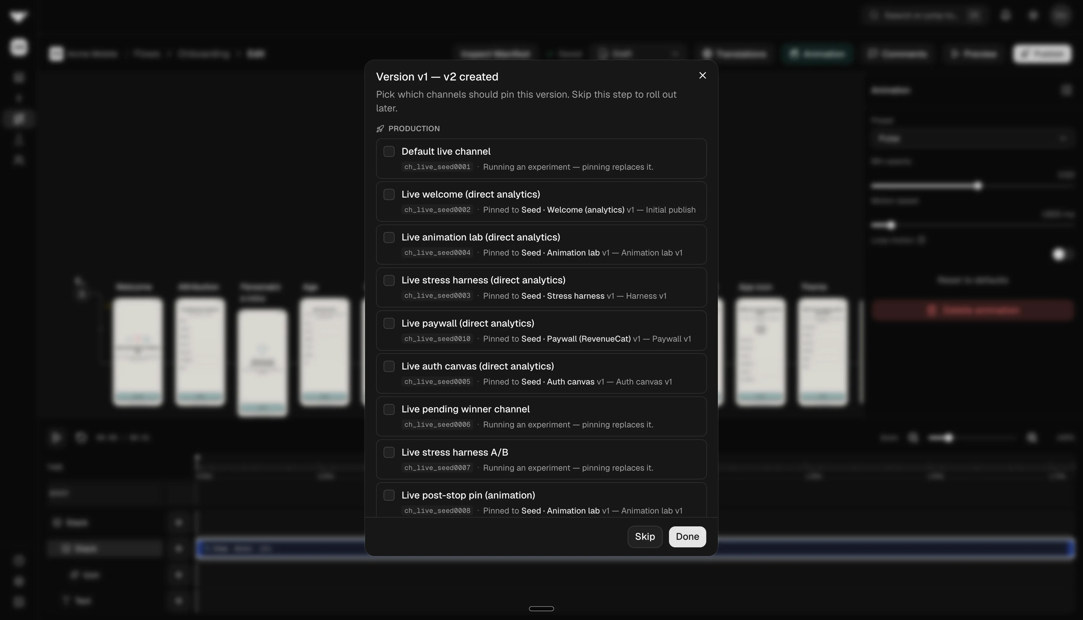
When the flow is ready, click Publish in the top bar. You can add an optional version label and choose which channels should pin the new version. Channels and experiments only consume published versions.
External surfaces and integrations
Add graph steps from the canvas add menu for steps that leave Rheo screen chrome:
- Integration Node — partner surfaces such as Stripe (always listed; paste a Payment Link on
buy.stripe.comor anotherhttps://*.stripe.comhost), RevenueCat, or Superwall (Grow+; enable in App settings). Wire purchase / cancel / restore (where applicable) / dismiss / failed outcomes plus a required Fallback path. Stripe has no restore. A return from the Payment Link advances the flow. Revenue is recorded only after Stripe confirms checkout on the app webhook. Pinning a version, or assigning it to an experiment, warns if the flow mixes mobile-only and web-only steps. See Stripe Payment Links. - External Surface Node — host-rendered custom UI (Grow+; no App Settings toggle). Set an optional Host key in the inspector (defaults to the node id
surf_*); your app registers a component under that key onFlowviaexternalSurfaces. Wire Completed, Back, Dismissed, and Failed (missing host component) plus Fallback.
Rheo blocks save and publish if Fallback is missing, or if a partner surface is used while that integration is off.
Canvas controls
App settings → Convert settings → Canvas controls lets you restrict which layer types appear in the editor for a given app. Examples include Lottie, OAuth login (preset and custom providers), email/password auth fields, and OS permission requests. Disabled controls also block publish if the flow still uses a turned-off capability. Your plan may further limit features (for example Lottie on Indie).
Request app review (button action)
Use Request app review on a button’s On tap action (or add the Rate the app preset from the Button family) when you want the native in-app store rating sheet after a positive moment.
- Submits the screen like Continue (inputs and checkboxes on that screen are captured).
- Always follows the screen’s default next step — no per-outcome branches in the editor.
- The OS may not show a prompt (rate limits, TestFlight, missing store config); the flow still advances.
- Editor preview and web simulators treat the tap as “not shown” and advance immediately; test on a device build.
Advance carousel (button action)
Carousels page by swipe. Add Advance carousel to a button’s On tap action when you want an explicit Next control alongside (or instead of) swiping. Pick the carousel to page — it must live on the same screen.
- On last slide decides what a tap does once the carousel is already parked on its final slide: Stay on last slide (default) or Complete carousel to follow the screen’s default next step.
- Landing on the last slide — by swipe or by tapping the button — completes the carousel when it does not loop and has two or more slides.
- Looping carousels never complete through paging; they wrap around instead.
- Single-slide carousels ignore the action. Use Continue when the button should leave the screen.
- Available in the web editor preview and the Expo / bare React Native SDKs.
Conditional (show different layers to different people)
Add a Conditional from the Logic group when one screen should look different depending on who is seeing it — locale, platform, an SDK attribute, or an answer the person already gave.
- A conditional holds branches plus Everyone else. Branches are checked top to bottom and the first one whose rules match is the one that renders; Everyone else covers the rest.
- Each branch is a stack you fill in like any other. Move branches up or down in the inspector to change which one wins first.
- Rules use the same editor as decision nodes. A branch can read locale, platform, SDK attributes, and any answer captured above the conditional — either on an earlier screen or from an input placed before it on this screen.
- Because only one branch shows at a time, each branch can ask its own question. The usual "one question per screen" limit applies to what a person actually sees, not to every branch you have drafted.
- Click the eye next to a branch to preview it on the canvas even when its rules do not currently match. Clear it to go back to live evaluation.
- If a person switches branches mid-screen, answers that only existed in the branch they left are cleared.
- Publish is blocked while any branch still has no rules — an empty branch can never match.
Use a conditional for differences within a screen, and a decision node for choosing which screen comes next.
Limits and permissions
- Publish vs edit depends on your workspace role and any approval policy tied to channels.
- Integration-dependent nodes require the matching app integration — see Apps & settings.
Troubleshooting
- Validation blocks save or publish: Read the issue list (missing targets, paywall Fallback, disabled integration, canvas control violations). Prefer inspector Fix actions when offered.
- Fill warning on width/height: Use Set ancestors to Fill, or set Fill / fraction on every ancestor up to the body stack.
- Motion stutters on device: Reduce concurrent clips or simplify layer counts on low-end hardware.
- Comments hard to find: Use canvas anchors and filters in the comments sidebar.