Customers & analytics
Per-flow analytics — funnels, drop-off, completion by segment, and response summaries across your audience.
What flow analytics answers
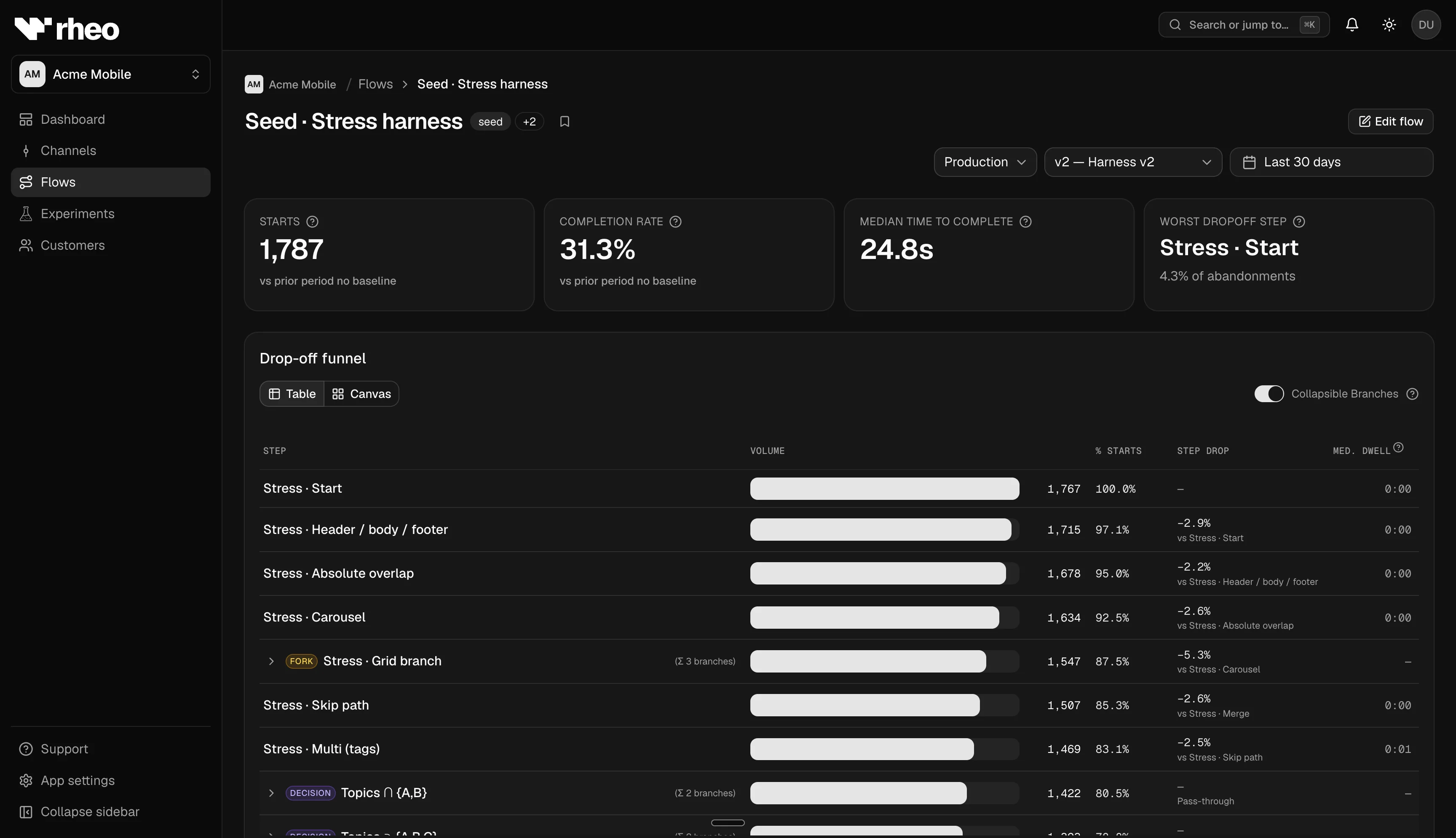
After you assign a flow through a channel, the analytics tab on that flow shows how the population behaves:
- How many people started and completed
- Where they dropped off in the sequence
- How long steps took
- How completion varies by platform, language, app version, experiment variant, or a custom property from your app
For a single user's timeline, use Customers instead.
Open flow analytics
- Go to Apps → (your app) → Flows and select a flow.
- You land on Analytics (not the editor).
- Choose environment (test or live) and a date range (presets such as last 30 days or a custom window).
- Optionally filter to a specific published version when you want metrics for one pin only. All versions blends data across pins according to how events were recorded.
Some cards compare to the prior period of the same length — helpful after a copy change or new publish.
Headline metrics
Typical cards include:
| Metric | Meaning |
|---|---|
| Starts | Distinct people who began this flow |
| Completion rate | Share of starts that reached a completion outcome (see in-product tooltip for the exact definition) |
| Median time to complete | Typical elapsed time from start to completion |
Rheo uses completion language rather than generic "conversion" so onboarding goals stay clear.
Funnel and drop-off
- Funnel — Steps in order with counts between screens. See cumulative throughput through the sequence.
- Drop-off — Highlights steps where disproportionate abandonment happens. Prioritize builder fixes here.
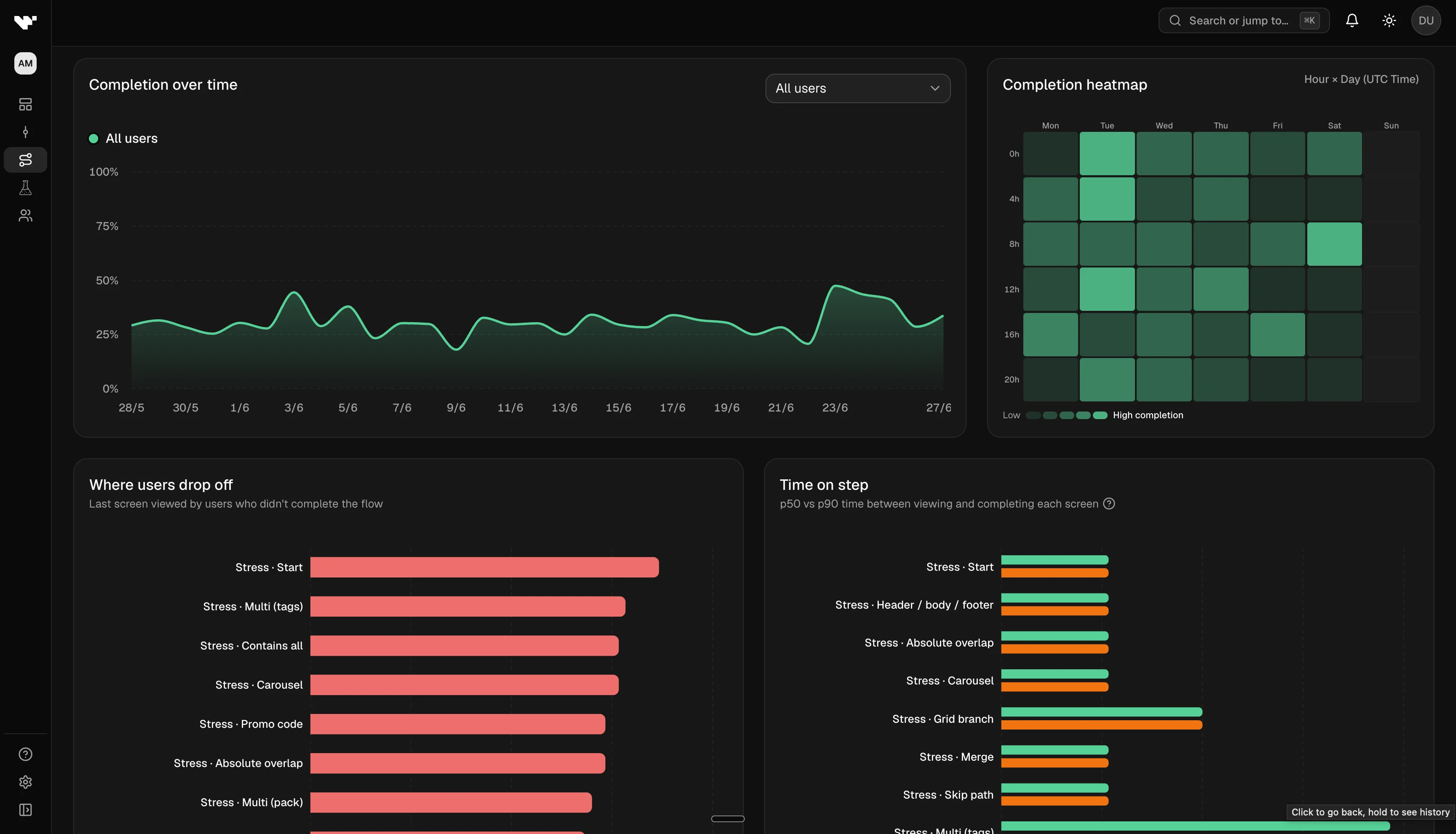
Step duration
Charts summarize time spent in each step — useful for spotting heavy media, slow network calls, or confusing UI that keeps people stuck.
Completion heatmap
The heatmap shows completion intensity across dimensions Rheo returns for your filters (for example locale or platform). Use it to find segments that lag the overall rate.
Cohort completion over time
Cohort charts plot completion over calendar time, split by:
- Platform (iOS, Android, …)
- Locale
- App version
- Experiment variant — compare arms while a test is running or after stop
- Custom property — a key your developers emit from the SDK (for example subscription tier)
When you pick custom property, Rheo selects the first available key automatically so the chart is not empty by accident.
Responses and field summaries
Where the UI exposes them, response panels summarize answers from input fields and similar controls — validate option wording and defaults without exporting raw events.
How channels and experiments feed these charts
Analytics reflect who actually received the flow through your channel assignments:
- A direct pin on a channel sends everyone on that channel to one published version.
- A running experiment tags events with the variant each person was bucketed into — filter cohort charts by experiment variant to compare arms.
- Test vs live environments are fully separate; always match the environment to the channel you care about.
Limits
- You need read access to the app workspace.
- After large traffic spikes, aggregates may take a short time to catch up.
Related
- Customers — per-user list, profile, and timeline
- Experiments — variant readouts and pending decision
- Channels & rollout — what population feeds these charts
- Concept: Customer